Stranger & Sons - Gin Bar
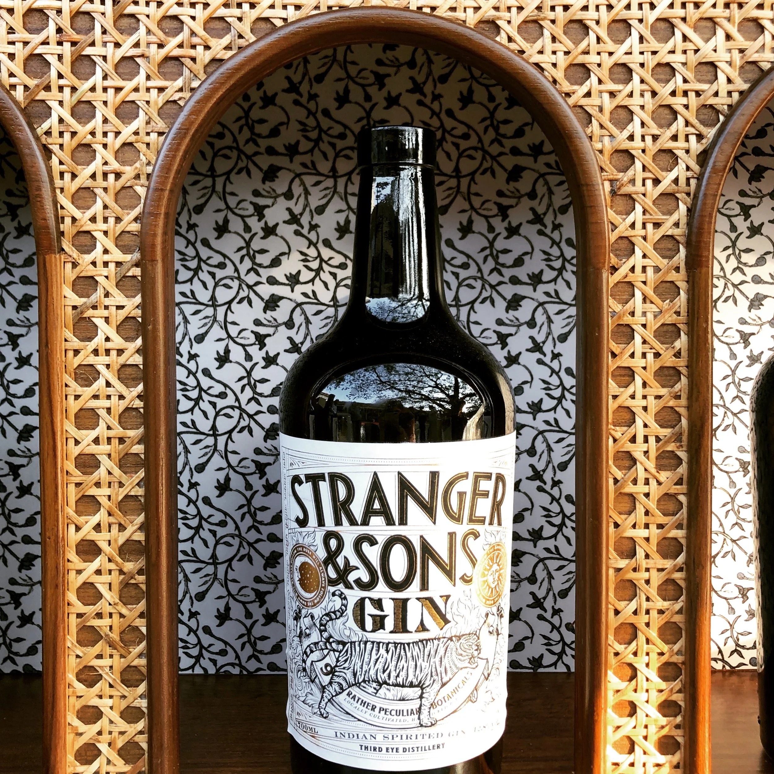
The label, deconstructed. The brand, made spatial.
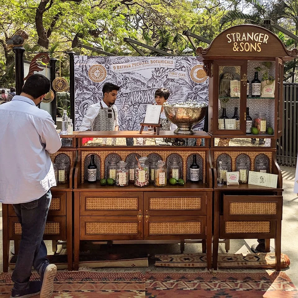
Stranger & Sons is a gin brand with a distinctly peculiar personality - curious, botanical, a little colonial, deeply Indian but entirely its own thing. The brief, developed in collaboration with branding agency Please See, was to take that label and turn it into a space people could walk up to, stand inside, and drink from.
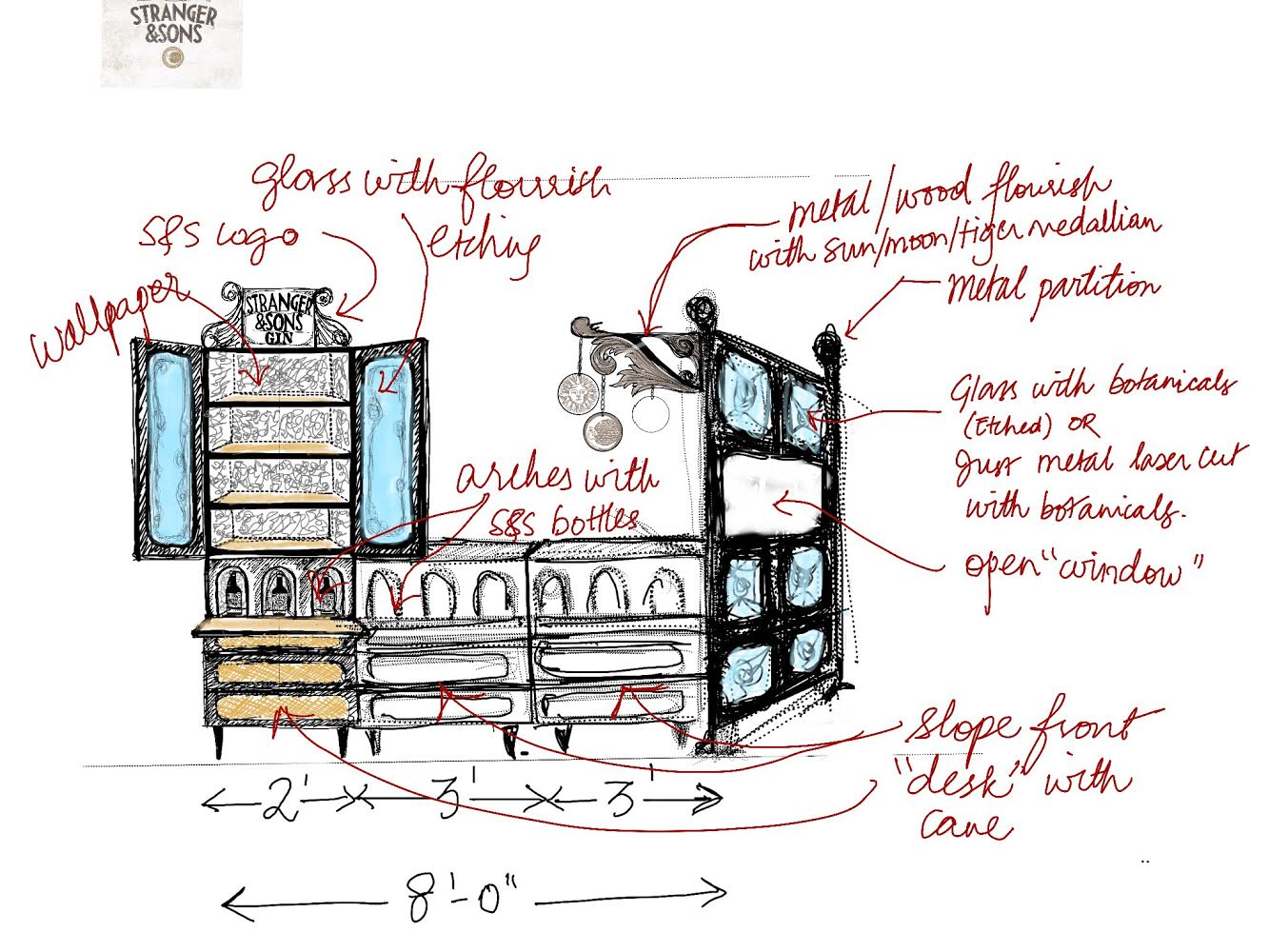
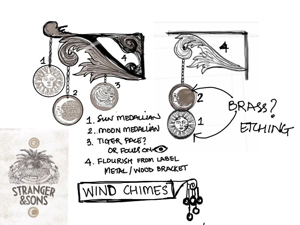
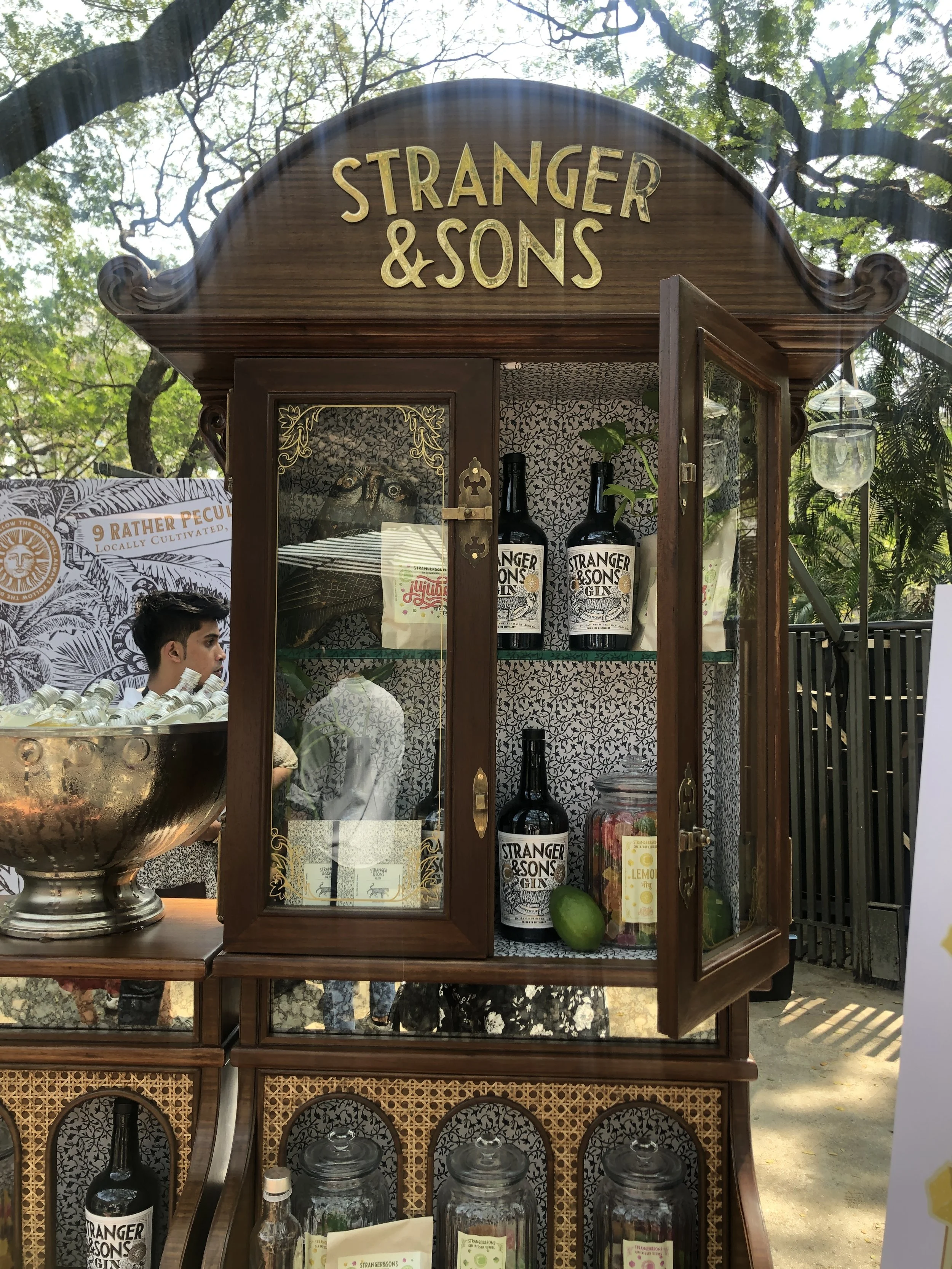
The starting point was the bottle itself. Every element of the Stranger & Sons label - the odd illustrations, the botanical references, the slightly eccentric Englishness filtered through a Goan lens - became a physical design decision. Not a themed bar. A deconstructed brand experience. Peculiar without being gimmicky. Curious rather than kitsch. The kind of thing you photograph because it makes you stop, not because it's pretty.
The bar was built to travel - designed for flexibility across different exhibition contexts without losing its identity. Since 2019 it has done exactly that. The concept holds because it was never about a moment. It was about a point of view.
Client
Stranger & Sons
Year of Completion
December 2019
Type
Travelling Bar